EDUCATION CENTRE
BASIC TYPES OF CHARTS
A large majority of traders use charts extensively. Therefore, it is important to have a sound understanding of the basics of technical analysis. Past performance is not a guarantee of future results. Technical analysis is only a tool for trading, and even targeted analysis is no guarantee of profits.
LINE CHARTS
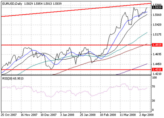
A line chart is the simplest type of chart. As shown in the chart of EUR/USD below, the single line represents the closing price for each day. Dates are displayed along the bottom of the chart and prices are displayed at the side.

A line chart's strength comes from its simplicity. It provides an uncluttered, easy-to-understand view of a security's price over a given period of time.
BAR CHARTS
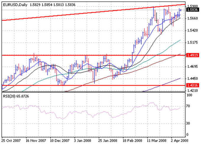
A bar chart displays a security's open, high, low, and closing prices for each time period. Bar charts are the most popular type of security chart.
As illustrated in the bar chart below, the top of each vertical bar represents the highest price that the security traded during the time period and the bottom of the bar represents the lowest price that it traded. A closing 'tick' is displayed on the right-hand side of the bar to designate the last price that the security traded during that time period. If opening prices are available, they are signified by a tick on the left-hand side of the bar.

CANDLESTICK CHARTS
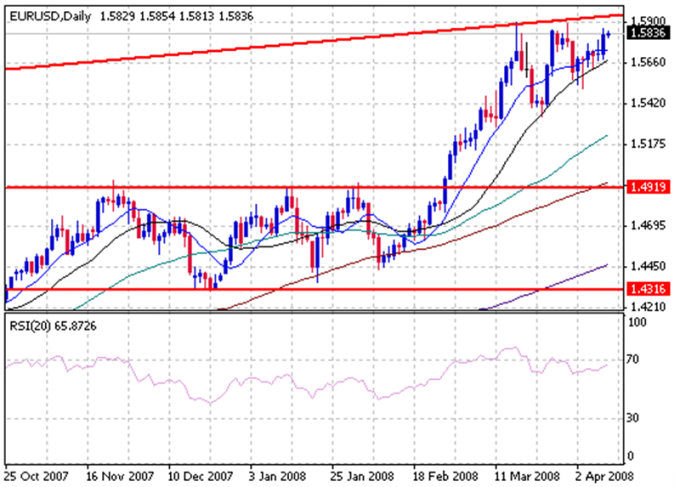
Candlestick charts display the open, high, low and closing prices in a format similar to a modern-day bar-chart, but in a manner that extenuates the relationship between the opening and closing prices. Candlestick charts are simply a new way of looking at prices - they don't involve any calculations.
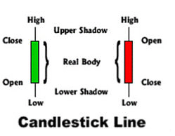
Each candlestick represents one period (e.g. day) of data. This diagram shows how to read a candle:

The candlesticks might be different colours (Blue/Red, White/Black, etc.), but the idea is always the same.


